CROP TOOL
IMPROVING THE MOST USED FEATURE ON SHUTTERSTOCK EDITOR

To comply with my non-disclosure agreement, I have omitted confidential information.
MY ROLE
I am the UX lead of this project. I defined the product and experience by doing research and working in the agile method with developers to scale the scope of the project. I evangelized customer goals and business goals with my product owner and used differentiation and story mapping to showcase my recommendation and product strategy.
impact
3 months after release, traffic improved by 25% and average time to complete cropping decreased from 5.9 minutes to 4.9 minutes. Conversion also increased as users went to downloading the cropped images from 51% to 59%.
HOW MIGHT WE IMPROVE our most popular feature?
I was asked to improve the cropping tool, Shutterstock Editor’s most used feature in three sprints.
The Discovery: Although popular, the crop feature is difficult to find and use
using UX Audit, CUSTOMER INSIGHT AND User research
I did a UX audit and with the findings, I used a mixed research methodology to evaluate the current state of our crop feature. Using analytics from Mixpanel, customer reports and unmoderated interviews, I discovered the following findings:

The crop icon is buried among the other feature icons. Locating the crop icons becomes difficult for users who don’t immediately recognize all the icons.
*Example error
2. The average user is going through the cropping experience, they are also scaling the image. Also, the way we currently handle background image vs foreground image disrupts the cropping experience when a user is using an Editor preset size.

3. Crop marks are difficult to see and grab.
“Crop hash marks should stand out more and be longer.”
“The corner handles were more noticeable to me at first --but I found them!”

4. Shutterstock Editor puts extra padding on its selector that makes it unclear what the size of the image is.
THE CHALLENGE: decrease time on task and improve discovery
Improving discoverability
improving INformation architecture: clarifying and Consolidating image related features

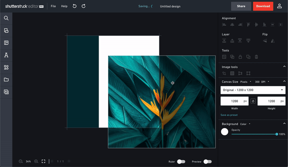
I renamed `Advanced tools` to `Image tools’ and moved the crop tools in the section.
The crop icon before was buried amongst many other icons and was grouped with features that were not directly related to the task at hand. I regrouped the crop icon with the other image specific features and renamed “Advanced tools” to “Image tools”. Then I added the “Tools” section to place the rest of the features that needed to be persistent.
improving Selectors
As aforementioned, our users were having trouble finding how to crop and locating the crop marks. I designed the selectors to be more bold and rounded giving it an updated look and removed the padding from the selectors.

Bolder selectors that can be easily seen on any image.

Removal of unnecessary padding.
Decreasing the number of interactions to crop
anchoring the crop and allowing users to move the image
When a user is creating a design, the user usually has a placeholder for an image in mind. In this mental model, the cropping experience of a user being only allowed to move the crop marks forces the users to know exactly the size of the cropped image beforehand. To combat I decided that the user should be able to move the selectors and not the crop marks.
Allowing users to simultaneously crop and scale images
Much of the cropping experiences include the user adjusting the size of the image to fit a certain size or placeholder - especially when creating a design. With the previous design, the users had to switch in and out of the crop mode - to scaling, back to crop mode, to scaling - to achieve the users’ intended result. To combat this, I designed a way for users to simultaneously scale the image and crop at the same time.

impact
As aforementioned, 3 months after release, traffic improved by 25% and average time to complete cropping decreased from 5.9 minutes to 4.9 minutes. Conversion also increase as users went from cropping to downloading the cropped images from 51% to 59%.